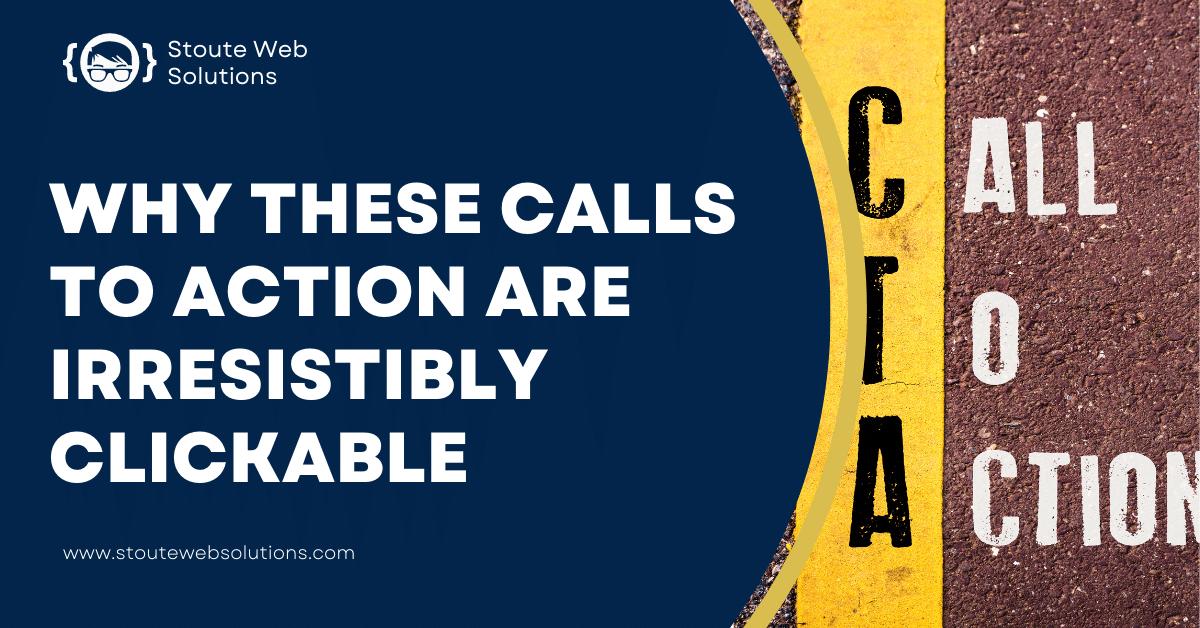
Why these calls to action are irresistibly clickable
Working hard on your business and not getting the results you want. This can be frustrating. When you put your all into something only to come up short, it can make you feel like you are not doing something right. How can you fix this?
If you need to know what is essential to your visitors, your copywriter probably doesn't either. This means they could communicate the wrong message with your CTA if they are not second nature to that person.
Use our blog to write the perfect call to action for your business. It will ensure that you are contacting your leads in just the right tone and communicating your offerings in the best way possible.
Design
It's no secret that clickable calls to action are essential to your website design. They help you convert visitors into leads, sales, and subscribers. But what makes a CTA so irresistible that people can't help but click?
There are many factors at play here. You want your CTAs to be prominent and easy to find, but you don't want them to be so large or flashy that they take away from the rest of your design. Your CTA should also complement the rest of your website, not stand out in a way that might make people uncomfortable or confused.
The most popular color for CTAs is blue—for a good reason. Studies have shown that blue is the most clicked-on color, with red coming in second. This makes sense when you think about it: Blue is associated with trustworthiness and stability, which makes it the perfect hue to use in a call to action.
Blue also has a calming effect on users' minds, which can increase their willingness to take action on a site or app. This is especially true when combined with other calming colors like green or purple, as seen in the examples below:
In addition to color choices, other factors play into how well your CTA performs:
Size matters—more oversized buttons perform better than smaller ones. Buttons that are at least 44 pixels tall convert best. (Designing for mobile? Make sure they're at least 28 pixels high.)
Button design matters, too—rounded corners seem to convert better than square ones (but don't go overboard).
There are many different types of CTAs, but they all share one thing in common: they should be designed to be as clickable as possible. That means they need to stand out from the rest of the page and clarify what your visitor will gain by taking that action.
Copy
An excellent copy is a motivator for action. Point out action words, command words, and attention-grabbing phrases. Make sure that your call to action (CTA) is actionable and not vague. Your CTA should indicate what you want users to do. The content below gives some of the best examples for creating persuasive CTAs:
- "Learn more."
- "Download now."
- "Get started"
- "Sign up."
- "Subscribe now."
- "Claim your gift!"
- "Get access now."
Clarity
It can be tempting to throw whatever words come to mind to get the viewer's attention. "Click here," "Subscribe now," and even generic, noncommittal phrases like "Learn more" or "Share this" are all commonplace. Still, they need to give readers a reason to click, watch, or share.
A good call to action needs to be a promise. It needs to tell users what they'll get from clicking (or sharing or subscribing, as the case may be). Few things are better at making a promise than numbers: "Save $50!" or "Download your free ebook!" are clear calls to action that show users exactly what they stand to gain by taking action. Similarly, promises of immediate gratification like "100% off" can make your call-to-action stand out from the competition.
The design and copy of your call-to-action need to work together. When you're writing your CTA's copy, remember how it will be visually presented with its design counterpart on the page—for example, a button that says something like "Click Here To Learn More" will look silly if it sits next to a giant photo of the same thing!
Unique appeal
With so many companies vying for our attention online, it's no surprise that we're becoming less and less likely to click on a CTA.
But what if you could make your call to action more appealing? Here are some ways to do just that:
- Use exciting language. If you can't think of anything clever yourself, try Googling "funny" or "clever" calls to action and see what results come up. There are plenty of examples out there already.
- Use fun animations or images. You don't have to go overboard with this; something small will do the trick. It's even better if it's interactive, so people can interact with your page in multiple ways (for example, by tapping on an image).
- Try something new. Feel free to experiment with different types of calls to action on your site and see how they perform compared to others. You might be surprised at what works best!
Grow your business
Focusing on keyword optimization, readable copy, and beautiful design is easy. Still, all that hard work can be undone by a call to action (CTA) that does not compel users to take action. Use this guide to create clear CTAs that convert your visitors into customer inquiries. Or get a free consultation with us!
Written by
Gladys Torzar
What's a Better Website Worth to Your Business?
Enter your current metrics to see how even small improvements in conversion and traffic can impact your bottom line.
Your Current Metrics
Your Results
Conversion Rate
0%
Qualified Leads/Mo
25
New Customers/Mo
8
Monthly Revenue
$75,000
Revenue Impact With a New Website
With +1% Conversion Rate
+$15,000/mo
+$180,000/yr
With +30% More Traffic
+$22,500/mo
+$270,000/yr
Combined Impact
+$42,000/mo
+$504,000/yr
Your website could pay for itself in months
Based on your numbers, a professional website redesign could generate an additional $504,000/year — a 63.0x return on your investment.
Book a Free Triage Call