How your website colors affect your customer
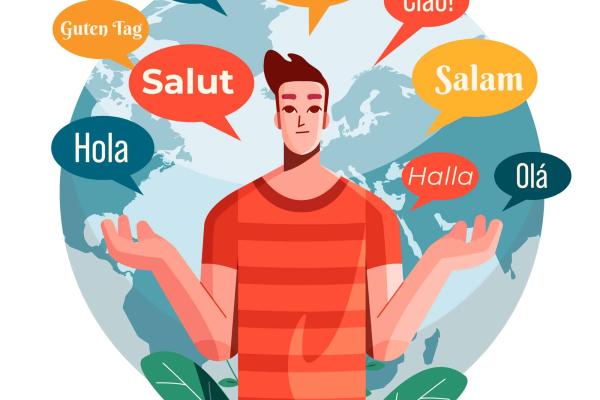
Your site is probably as important to you as it is to your visitor. But how do you ensure that your design gives off the right vibe?
Many businesses struggle to create a sales-friendly environment because they don't know what actual colors can be. Most sites are filled with many colors at once, making it hard for your visitor to establish a sense of unity and cohesiveness.
This article will show precisely why and how different colors affect your visitor's perception of your site and what you can do about it. Analyze which colors work best where on your site. Increase site conversions by using our software to explore color combinations!
Importance of color in your website
The color is compelling. It can affect mood, persuade a reader to take action, or even alter their perception of the size or shape of an object. When designing your website, getting caught up in the minutia of layout, font size, and image placement can be easy. But one thing that's often overlooked: how many colors should you use in your web design?
It's essential to choose colors that reflect the brand of your business. Color is the first thing a reader notices about your website, setting the tone for their experience with you.
So what does this mean? First and foremost, it means that you should understand what your business is all about and who your target audience is. Once you know who you're trying to reach—and why—you can make color choices that resonate with them. Here are some examples of commonly used colors and what they signify to a customer to find out more about what works best in your web design today.
Blue
Blue is a trendy color for websites. It is often used in conjunction with white, black, grey, and other colors to create a very stylish professional look. Blue has many meanings and has been used for centuries in art and design to create calming effects on viewers.
The meaning of the color blue in your website design is one of the most important factors to consider when designing a website. Blue can be used in many ways to convey information to users and visitors.
The Meaning of Blue
Blue is often considered a calming color, which makes it perfect for use on a website that's meant to be relaxing or calming. For example, suppose you're designing a website for an online store that sells products that help people relax, such as bath soaps or massage oils. In that case, you may want to use blue as one of your primary colors to give your customers the feeling that they are on a relaxing "vacation" whenever they visit your site.
Blue can also represent intelligence or wisdom in some cultures around the world, so if you're designing a website for an educational institution or school, using blue in certain areas of your design can help communicate this idea to your audience with minimal effort on their part.
Red
The color red is associated with energy and passion, which can be used to get your customers' attention. Use it as a highlight on your website's most essential features, or use it with other hues to create contrast and make those features stand out even more.
Red is also an attention-grabbing hue that can be used to draw attention to important messages on your website or landing page. Red is the most vital color psychologically and will grab people's attention first. When you want people to take action, such as by filling out a form, using red text on a form header can help increase conversions.
In website design, red creates a sense of urgency and action. Suppose your company has a product or service that needs to be sold quickly before it expires or becomes obsolete. In that case, you should use red on your website to help drive this urgency home. For example, suppose you are selling tickets to an event. In that case, you might want to use red on your landing page because this will create an increased sense of urgency among your visitors, so they buy now rather than later.
Red can also be used as a warning sign on your website if any dangers are associated with what you are selling or offering as part of your service. For example, if you are selling food products online and the FDA has recalled them because they may cause food poisoning. Then using red could be beneficial because it would draw attention to this critical information right away so people can avoid making any mistakes when buying food from your site.
But red has its drawbacks, too: It can make people feel uneasy or anxious if used too much or in certain contexts. Red should be used sparingly in specific contexts—for example, when selling food products or in more conservative cultures where bright colors aren't popular.
Green
Green is a great, restful color and is the color of nature and life. It is a positive color that can help you feel calm, content, and in control. Green is also a neutral color that does not have any negative connotations. It simply means growth and renewal.
Many web designers use green for their websites because it has a calming effect on visitors. Green can also be associated with nature, giving some websites an outdoorsy or environmentally-friendly feel.
Several shades of green include light green, dark green, lime green, and forest green. Each shade has its characteristics and meanings. This gives your website versatility in its design and appeals to your customers.
When we think of "green," we usually think of money, saving the environment, and recycling. Still, other connotations of green are more abstract, including envy, jealousy, and inexperience. As you can see from this list, green is a very diverse color with many meanings depending on how it is used in the design.
Orange
Orange represents the energy of creativity, stimulation, and warmth in a website design. It is usually used to grab customers' attention and bring them to your website.
Orange is powerful in attracting the viewer's attention due to its high visibility and brightness. It means the 'feel good factor, it attracts people's interest, and it is positive and full of life. Orange creates an energetic feel and makes you want to do things. It will excite you as well as others around you. It is a symbol of happiness, joy, and enthusiasm. Orange can uplift you, giving you the energy to take on new projects and ideas. It can stimulate your thinking processes and encourage new ways of tackling problems.
On the flip side, oranges can be a bit abrasive for some people. Some may even find it offensive. So use it carefully in your design to avoid any adverse reactions.
For orange to have the best effect on your site, you must take advantage of contrasts. If you want to make something stand out, make it orange. If you bring a particular image or message forward, use orange with it. You could also use orange in combination with other colors that complement it. For example, if you have a lot of blue on your website, try using orange in an accent or as a complementary color on one small part of the page.
Black
Black is the color of authority, mystery, power, and elegance. It is timeless, classic, and never goes out of fashion. The color black has a sobering effect on people, so it can be used to create an atmosphere of seriousness for a business or occasion. The color black can be used in many different ways depending on the site you are designing, from creating an elegant look to a dramatic one. The possibilities are limitless with this powerful color.
Black also psychologically impacts people: it creates feelings of sophistication, formality, and luxury. This can be helpful when designing websites that need to convey these messages, but only if done in moderation, as overuse of black can create feelings of loneliness and depression since it is such a depressing color.
Start adding colors to your website.
Choosing the right color palette can be hugely beneficial to your brand. It's not always an easy decision, though, especially if you're unsure of what colors mean and how your picking those colors will affect who they help your brand appeal to. Don't hesitate to contact us to help you make more informed choices when picking out color palettes on the Web!
Written by
Gladys Torzar
What's a Better Website Worth to Your Business?
Enter your current metrics to see how even small improvements in conversion and traffic can impact your bottom line.
Your Current Metrics
Your Results
Conversion Rate
0%
Qualified Leads/Mo
25
New Customers/Mo
8
Monthly Revenue
$75,000
Revenue Impact With a New Website
With +1% Conversion Rate
+$15,000/mo
+$180,000/yr
With +30% More Traffic
+$22,500/mo
+$270,000/yr
Combined Impact
+$42,000/mo
+$504,000/yr
Your website could pay for itself in months
Based on your numbers, a professional website redesign could generate an additional $504,000/year — a 63.0x return on your investment.
Book a Free Triage Call