After more than a decade of building websites and growing businesses online, we decided it was time for Stoute Web Solutions to get something we've helped so many of our clients achieve — a fresh brand identity that reflects who we are today.
Here's the story behind the change, what it means, and why we're more excited than ever about where we're headed.
Where We Started
When I founded Stoute Web Solutions in 2012, the logo was personal. It was a headshot of me — glasses and all — framed by an opening and closing curly brace: `{ }`. If you've ever written a line of code, you know those braces mean "everything between here is handled." That was the message: from start to finish, Stoute has you covered.
It worked. Clients told us the logo felt approachable. It said, "There's a real person behind this company who writes code and cares about your project." For a solo founder building trust one project at a time, that was exactly right.
But over the years, something shifted. We grew from a one-person operation into a full-service digital agency. We added SEO strategy, WordPress hosting, speed optimization, ongoing maintenance, and content services. The team expanded. The client roster grew from local Portland businesses to companies across the country.
The brand needed to keep up.
Why We Rebranded
This wasn't a decision we made lightly. We've seen too many businesses rebrand for the wrong reasons — chasing trends, copying competitors, or changing things just to feel new. That's not what this is.
We rebranded because the old identity, as much as we loved it, was telling a story that was no longer complete. The curly braces said "we write code." But we do so much more than that now. The headshot said "it's just me." But it hasn't been just one person for a long time.
We needed a mark that could represent the full scope of what we do — while still carrying the values that built this company.
The New Logo: What It Means
Our new icon is a hexagon with three intersecting internal lines and a solid node at the center. Every element was chosen with intention.
The Hexagon
Hexagons are everywhere in nature — honeycombs, basalt columns, molecular structures. They're the most efficient shape for covering a surface with no wasted space. Engineers and architects love them because they're inherently strong.
For a web agency, the hexagon represents structural integrity and efficiency by design. We don't just make things that look good — we build systems that are engineered to perform. It also mirrors the modular nature of modern web development: interconnected components working together as a unified whole.
The Network Lines
Three lines cross through the hexagon, connecting opposite vertices and creating six segments. They represent connectivity and the multiple disciplines we bring together — design, development, SEO, hosting, strategy, and support.
Where the old curly braces symbolized code, the network lines symbolize the broader digital ecosystem we operate in today. Your website doesn't exist in isolation. It connects to search engines, social platforms, analytics, email marketing, and your customers' devices. Our job is to make all of those connections work.
The Center Node
The solid circle at the heart of the icon is the anchor. It represents your business — the client at the center of everything we build.
Every line connects back to it. Every strategy we develop, every page we design, every optimization we make radiates outward from your goals. You're not a ticket in a queue. You're the reason the whole system exists.
It also carries forward the spirit of the original logo. There's still something human at the center of this mark. We're still a team of real people who care about your project — we just have a bigger toolkit now.
Reading It Together
When you see the full icon, it reads as a network hub — a central node in a larger connected system. The message: We're the team that connects all the pieces of your digital presence and holds them together.
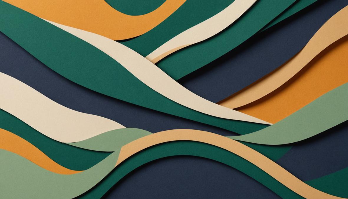
The Color Palette
Color isn't decoration — it's communication. Every color in our new palette was chosen to say something specific about who we are and how we work.
Deep Forest Green
Our primary brand color is a rich, grounded forest green. Green represents growth, balance, and prosperity — the exact outcomes our clients are investing in when they work with us.
We deliberately avoided the bright neon greens you see in startup branding. Forest green communicates maturity and longevity. We've been doing this since 2012, and we plan to be here for decades more. It's also a nod to Portland — a city defined by its evergreen landscape, where we've been rooted from day one.
Warm Amber
Our accent color is a warm, confident amber. You'll see it on every call-to-action button, every highlight, every moment where we invite you to take the next step.
Amber creates visual energy and warmth without the aggression of red or the caution of yellow. It feels like an invitation, not a demand. When you see that amber "Get Started" button, we want you to feel welcomed — not pressured.
Warm Cream to Rich Charcoal
Our background palette runs from a soft, warm cream to a deep charcoal. The warmth in the lighter tones prevents the site from feeling cold or clinical. It says we're approachable and human. The deep charcoal provides contrast and anchors the design with trust and seriousness — without the harshness of pure black.
What Didn't Change
A rebrand can feel like a company is becoming something different. We want to be clear: our values haven't changed.
We still believe in building websites that work as hard as you do. We still pick up the phone. We still explain things in plain English. We still care more about your results than about following design trends.
The old logo said: "Hi, I'm Paul, and I write code for you."
The new logo says: "We're a connected team that puts your business at the center of a well-architected digital strategy."
Both statements are true. The second one just tells more of the story.
What This Means for You
If you're an existing client — nothing changes about how we work together. Same team, same commitment, same results. You'll just notice a fresher look when you visit our site, open an invoice, or see us in your inbox.
If you're discovering us for the first time — welcome. The new brand is our way of showing you, at a glance, what kind of partner we are: structured, connected, and built around your success.
Looking Ahead
This rebrand is part of a larger evolution at Stoute Web Solutions. We're investing in better tools, deeper expertise, and more comprehensive services — all aimed at helping our clients grow faster and more sustainably online.
The hexagon on our new logo isn't just a shape. It's a promise: everything we build is designed to be strong, efficient, and connected — with your business at the center.
We're excited about this new chapter. We hope you are too.
---
Stoute Web Solutions is a Portland, Oregon-based web design and digital marketing agency founded in 2012. We specialize in web design, SEO, WordPress development, and managed hosting for businesses that are serious about growing online.

Written by
Paul Stoute
Founder & CTO
Paul founded Stoute Web Solutions in 2013 with a simple goal: build websites that actually drive results for small businesses. With over a decade of experience in web development and digital strategy, he leads the technical vision behind every project — from custom builds to SEO and CRM automation. Based in Portland, Oregon.
Find Out What's Holding Your Website Back
Get a comprehensive audit covering over 100 ranking factors — from technical SEO to content gaps. No obligation, no hard sell.